Have you read Part 7 of the Making a Side Project series?

Photo by Tamarcus Brown on Unsplash
Before I jump into building Deaton, I like to think about the totality of that I’m trying to build.
This means considering the sitemap, wireframes and how people will interact with different features and how they’ll navigate between different parts of the site. I also like to think about the overall technical architecture and consider what if any external resources I’ll need.
“A site map is a list of pages of a web site.”
— Wikipedia
I try not to go crazy here, there will a number of static pages that will be easy to add, I’m more concerned with pages that include functionality in them that I need to build.
The MUP for Deaton is pretty small, and so the number of pages I need to build is pretty small too.
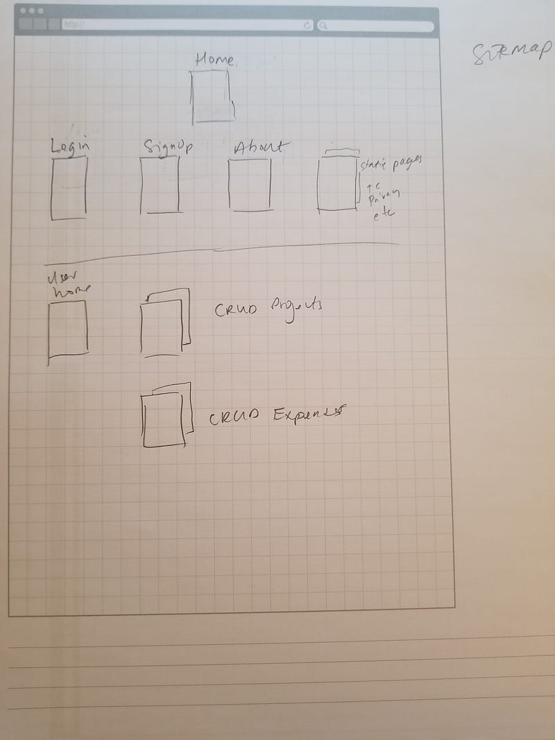
Sitemap
You may notice that I’ve also left of some fairly standard pages. Change password, account settings, etc. They are standard pages I know I have to build. They do not contain Deaton specific functionality so I don’t worry about them for now.
“A website wireframe, also known as a page schematic or screen blueprint, is a visual guide that represents the skeletal framework of a website.”
— Wikipedia
For the MUP I try to keep the layout of the website pretty consistent. There are typically 3 layouts I consider. I had also considered building a custom landing page, but the Product Hunt Upcoming page is doing a splendid job so that will save me some time.
In many respects this is the most important page of the website. It is typically the first page that a new user will see on your website. It is very important to make a good first impression.
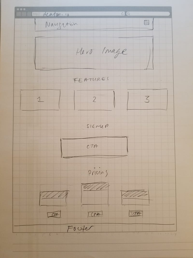
The page will start simple and short, and as we continue to add features and hopefully get feedback (and testimonials) we can update the page.
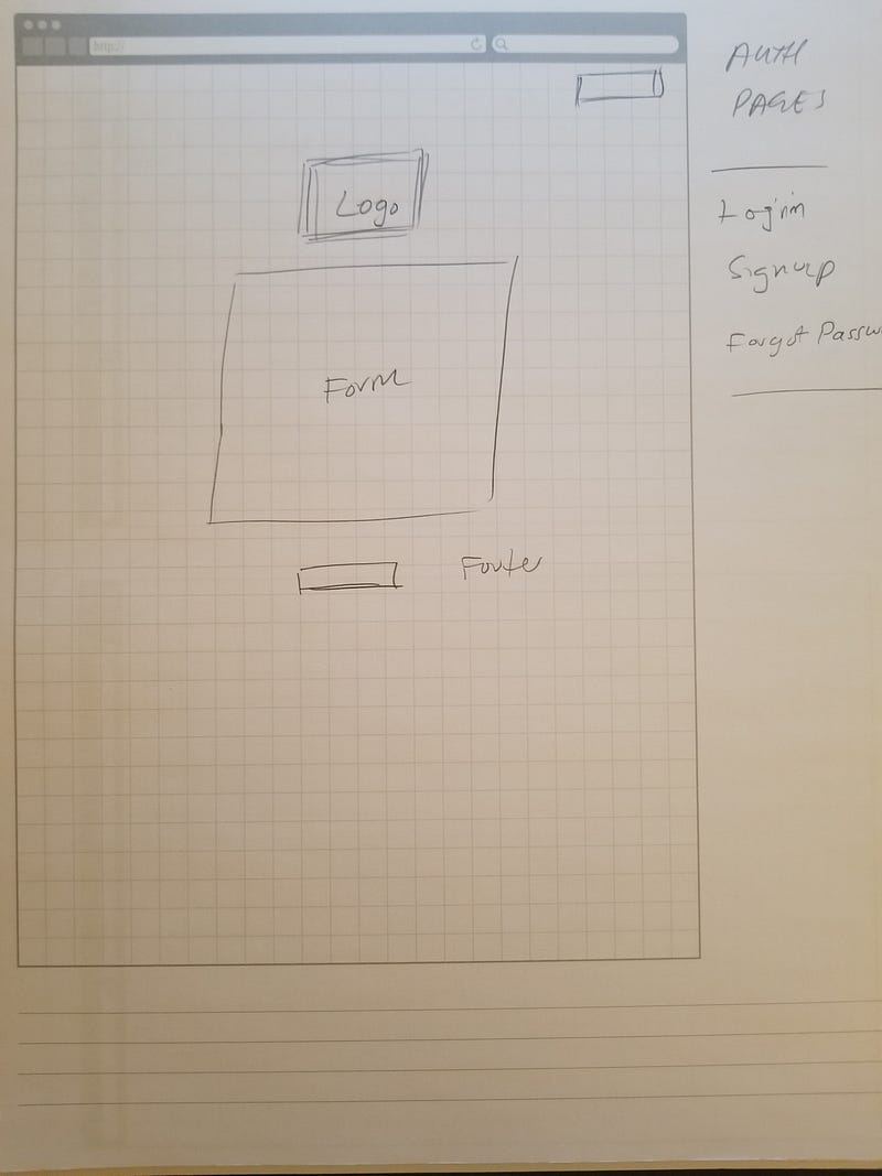
These are typically very light, a simple layout for pages that have a single purpose. We want to get users logged in or registered as quickly as possible with no distractions, and into the application.
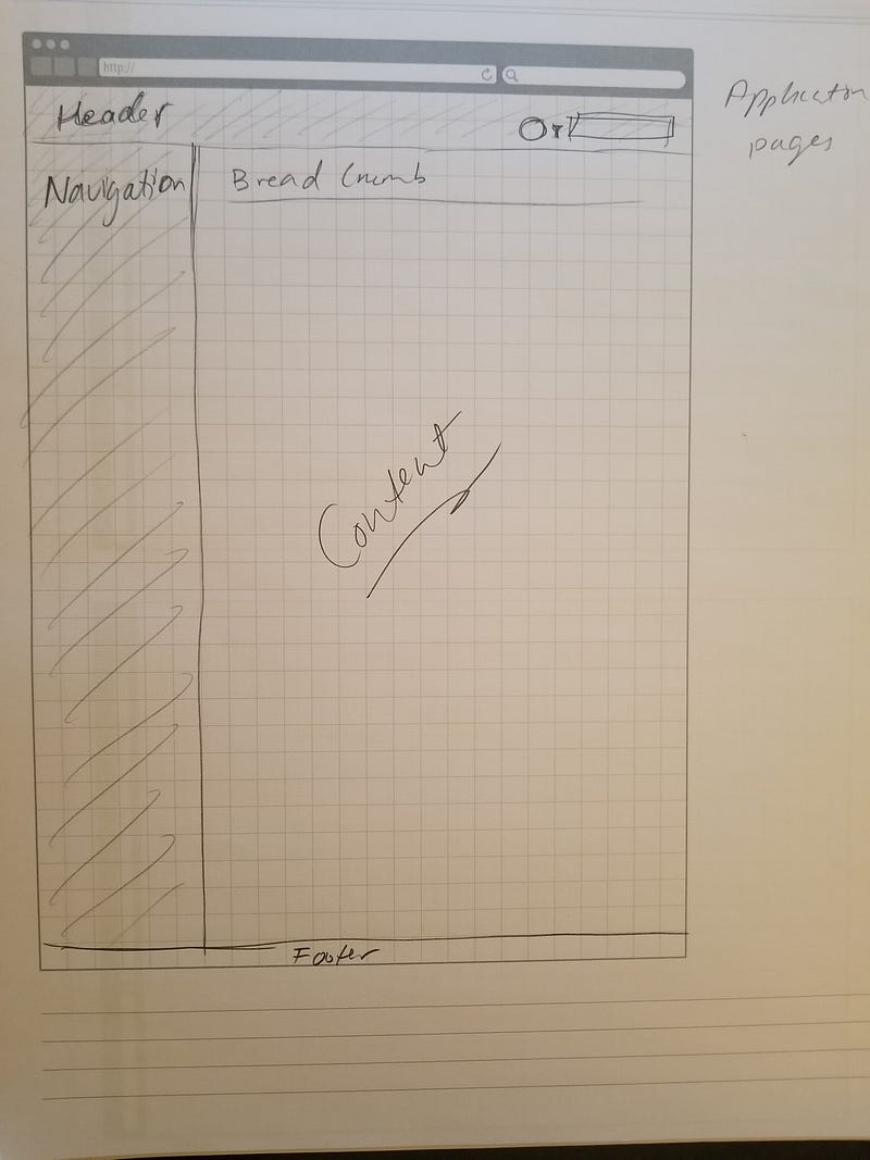
The majority of the actual application pages will use this layout. This is pretty standard layout used by a lot of applications. It works, I’m not going to invent anything new.
The amount of data that I need to collect for each element is pretty small. For a project we just need a name, logo image, and perhaps a URL. For expenses we just need to collect the amount, description, and if it is a recurring expense or not.
The navigation on the left hand side, will provide a quick way for the user navigate to different parts of the application. Switching between projects, links for added expenses, will always be present.
The MUP for Deaton, really isn’t going to require anything special. A pretty normal web application, LaravelPHP with Bootstrap for the HTML/CSS and perhaps a little VueJS sprinkled in.
Future version will get a little more complicated, as we try an integrate with external services to automatically extract expenses, etc.
Nothing much in the way of external resources, just a way to send emails for that dread forgot password, and the invitations.
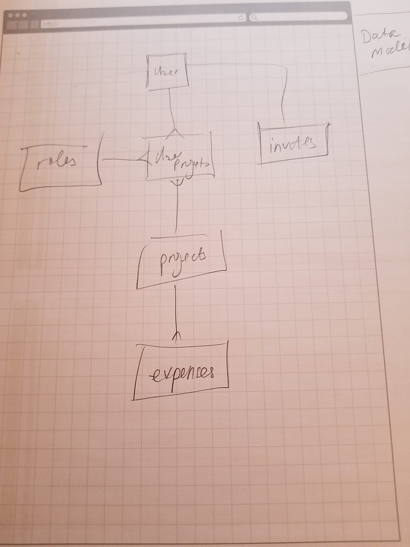
Just a handful of models will store all our data. This will definitely grow as we add more features, but keeping things simple for now. I haven’t broken down all the fields on the tables. I have a pretty god idea in my head, and that will flow pretty quickly directly in the code.
If I wasn’t documenting my process here, I probably wouldn’t have taken the time to sketch everything out here. It’s small enough just thinking thru everything, I’m able to remember everything I need as I run thru the coding up the application.
I think that’s all we need to get into coding!
—