Have you read Part 6 of the Making a Side Project series?
Photo by Joanna Kosinska on Unsplash
Recently I’ve been partnering with a designer for most of my side projects. I’ve worked with Seth Louey, Daniel Kempe, Joe Arcuri and Dimitar Raykov on recent projects. Since I was going to be document the process of making, from start to finish I thought I’d design this one myself (kinda off).
Although I’m not a designer, I’ve been working along side designers for my whole career, and I’ve tried to learn as much as I can. I currently work at AREA 17, a digital product agency with deep roots in design.
AREA 17 has published its design philosophy in a guide they encourage everyone at the company to read, and is now also available for anyone outside the company to read…
Design techniques - AREA 17
_Design techniques, methodology and best practices at AREA 17._guides.area17.com
Although not available yet Refactoring UI, by Adam Wathan and Steve Schoger looks like it will become an invaluable resource for developers who want to make great looking websites. The case studies they have shared so far have been fantastic.
Good design is hard, but with a little guidance you can get a long way, until you can get some professional assistance.
I’m a big fan of grid based design, and of the Bootstrap framework. This combination has got me pretty far to building and launching my side projects.
I recently built Hackathon Match for the hackathon many of you are participating in. Due to the time constraint I rushed to build the website in a single evening. Since I was in a rush to launch the site I decided it would be better to design it myself and used as much of the Bootstrap framework as I could.
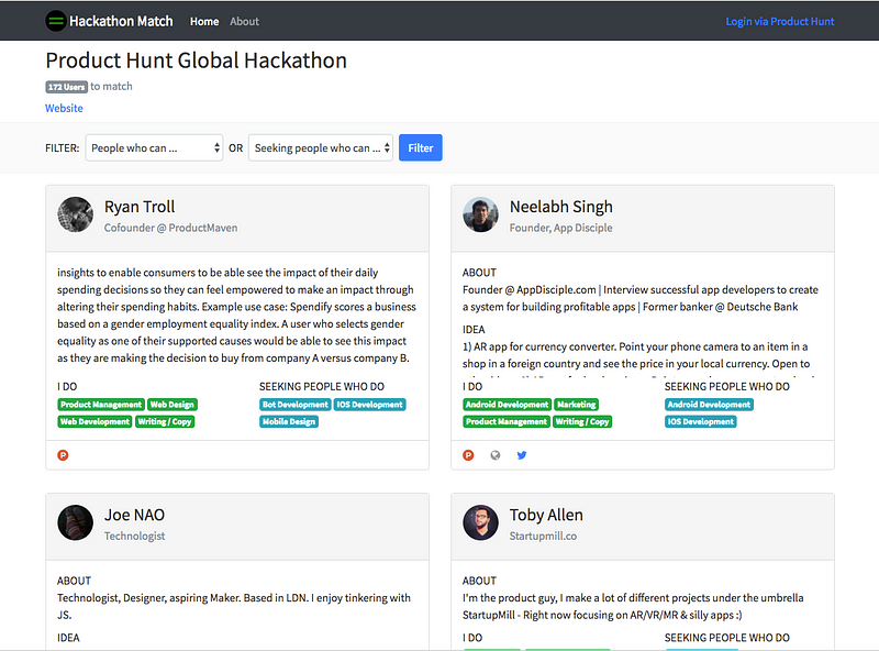
This makes both the design and the development relatively simple. In these situations I typically design directly in the browser, having first made some rough sketches on paper. Yes good old paper and a pencil. While the design is not the best, the website was good enough to get over 300 up votes on Product Hunt. Close to 300 people signed up to use the service.
Conversely when I built Wallet List, also for the Product Hunt hackathon, I worked with Seth Louey. I’ve worked with Seth on a number of projects, and we’ve work together very well. We are able to discuss a project, the core functionality and both go off and do our own thing. He focusing on the branding, UI and UX, and with me focusing on the building the functionality. We are able to then combine the two and create a beautiful, functional application.
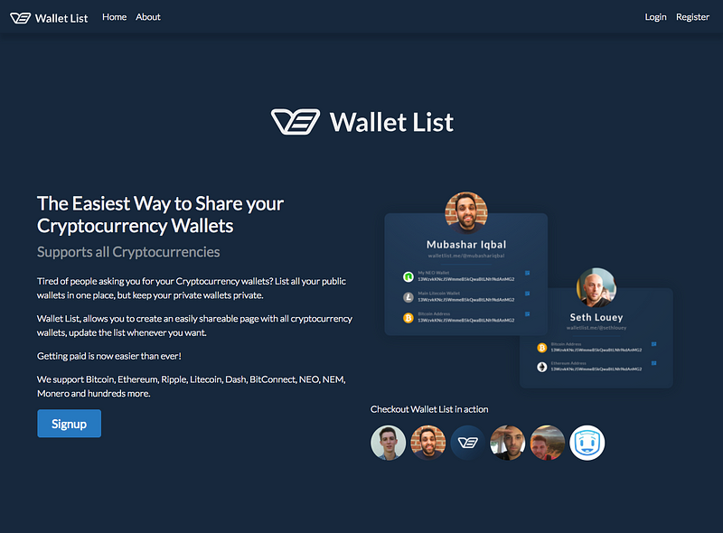
It takes working together for a while, before you efficiently and effectively work in this way. It’s taken a few years of working together for Seth and I to get to the point we were can build and launch a project in a single day, even though he now lives in Texas and I live in NY.
As you can see from the screenshots, Wallet List looks much better, but I’m very happy with how Hackathon Match turned out.
As soon as it was decided what I would be building, the now named Deaton, focusing on startup expenses, I started to think about what I wanted it to look like.
I wanted to keep things simple, light and quick, so a Flat design seemed to make sense. Deciding on colors for a design, is often the hardest part of the process for me to decide upon. I decided to kill two birds with one Fiverr stone.
I decided I wanted an illustration for the homepage, but doing that would definitely be too much of my limited design skills, so I thought I’d try getting something from a designer on Fiverr, something anyone working on a side project would be able to do cheaply.
I could then take the colors used in the illustration and make that the color palette for the website.
I searched on Fiverr for someone who might be a good fit for the task, and then as luck would have it someone on the Indie Hackers forum posted a link to someone they had used on Fiverr, and I liked the work, so I jumped in.
I placed the order, and kept the instructions very simple, and little bit vague…
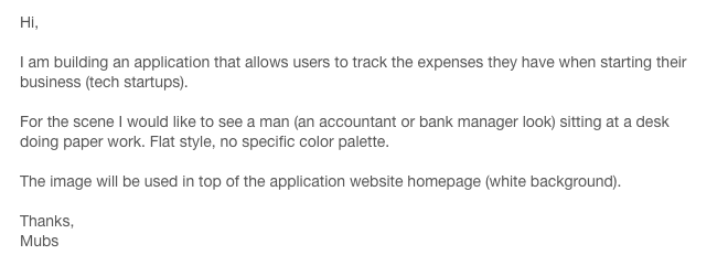
When I work with others I prefer not over explain what I want. I want them to do what they feel is best, not what they think I want.
3 days later I got a email when the with the work was completed.
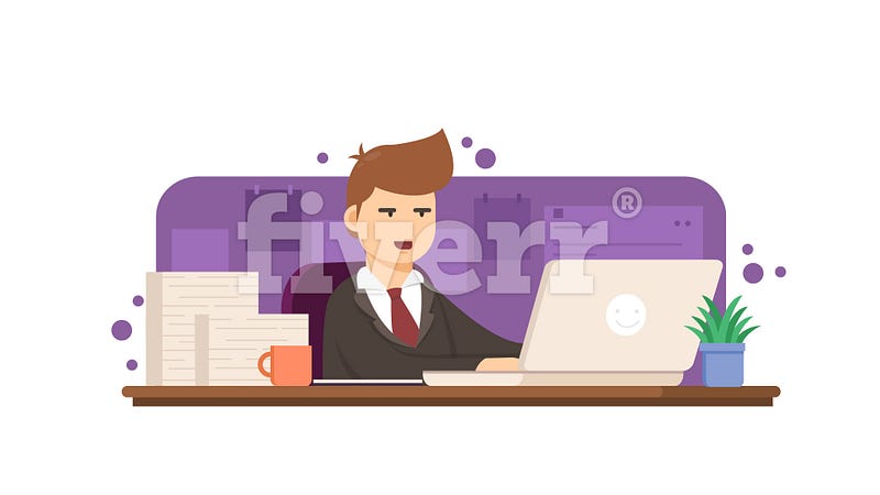
Deaton Marketing Website Image via Fiverr
Well that looks pretty dang great! The purple and beige would make for the basis of a a great color palette.

Deaton Color Palette
Now I had a name, a color palette and a very cool graphic for the top of the webpage. I needed a logo.
I wanted something simple, I like simple marks or a single character as the logo. Since I’d gone for a short simple name, Deaton, I decided to see if I could make something work with the letter D.
Since we’re tracking expenses, likely in a list of some sort, I wanted to see if I could combine that with the letter and something unique. I fired up Sketch and started playing around.
I could make the D from scratch, it’s a simple shape, but I wanted to use the letter from a Font, that could then be used to write the name.
I spotted a font on Designer News that I really liked the look off:
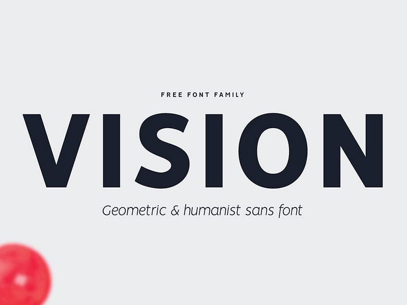
Didn’t take long from there to get to something nice and simple …
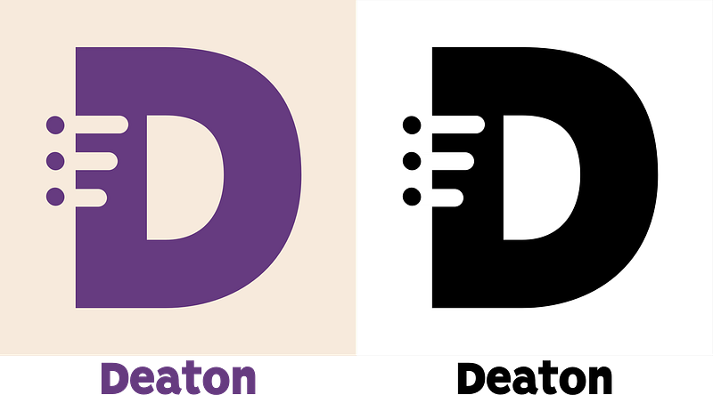
Deaton Logo
Works well in both the website color palette, and black and white.
With the combination of the header image, the logo and the color palette, I have what I need to move into the browser to start building/designing.
I am however going to spend a little time wire framing the various pages of the website. Once I finish those drawings, I’ll update you all with another post.
Since I now know what I’m building, have a name and have logo I decided to update the Product Hunt upcoming page. It includes the logo and the color palette.
Deaton - Product Hunt
_Deaton - Track your Startup Expenses on Product Hunt_www.producthunt.com
Update: Lots of people have asked about the seller on Fiverr who I purchased the illustration form, here’s the link:
conania's public profile on Fiverr
_Reset Password Please enter your email address and we'll send you a link to reset your password. Not a member yet? Join…_www.fiverr.com
—