
Building data visualization can be a lot of fun. I share how I quickly built a bar race chart for the Product Hunt Maker race from 2013-2019.
While working on a new feature for Maker Network I needed to break down when makers had their products featured on Product Hunt.
Using this data I could build a "Weekly Leaderboard" of the Top Makers
Once I had the data and build the simple table based display, I was thinking of different ways to display the same information.
I was reminded of this video of the Top 15 Best Global Brands Ranking over the last 18 years.
I thought something similar could be cool to see the rankings of the top makers on Product Hunt.
I thought something similar to see the rankings of the top makers on Product Hunt would be cool.
As a coder my first instinct is usually how I do build something like this myself. I've built lots of charts before but animating them based on some time series is something new for me.
From javascript based charts to languages like R there are lots of ways to build bar charts and ways to animate them on a time interval, but it looked like a lot of work. Since this wasn't exactly the point of what I was originally building I figured I should at least see if there was a quicker way of doing this.
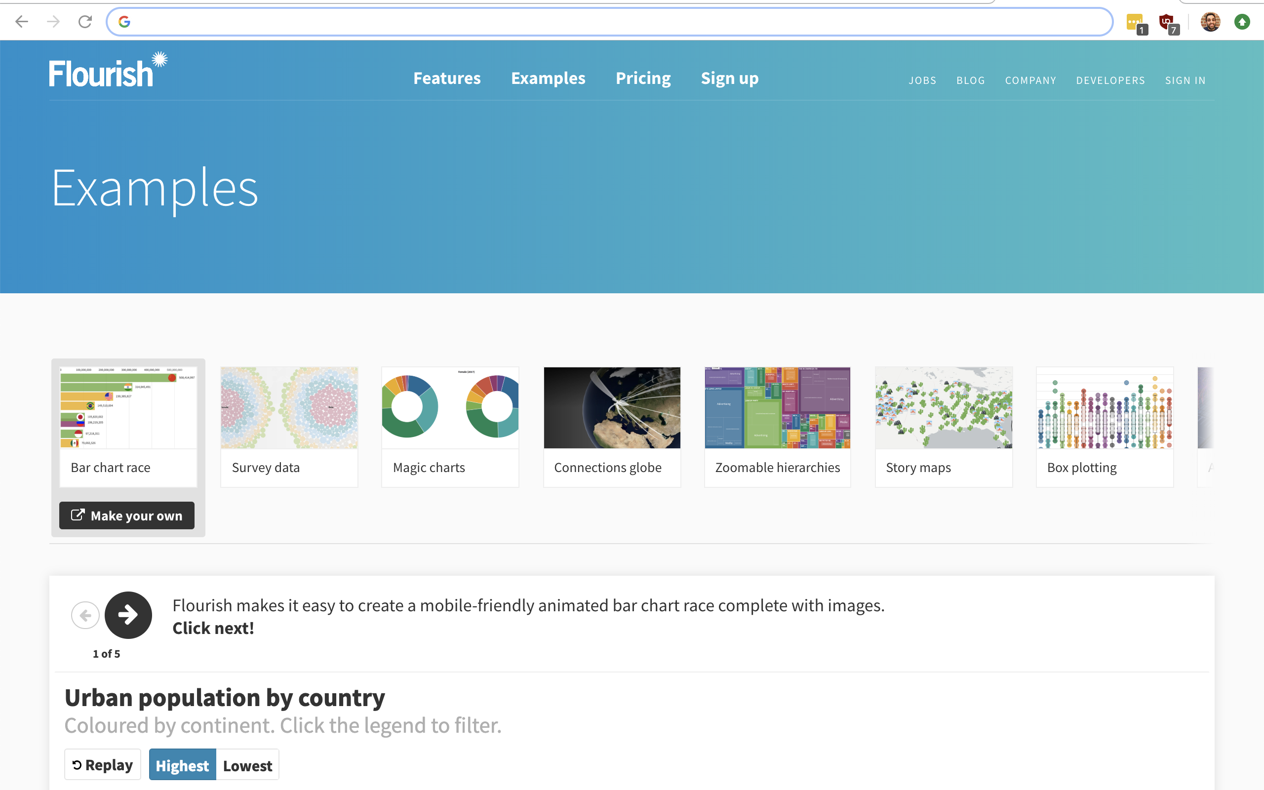
After a bit of googling and actually figuring out the popular name for this kind of charts was a "Bar Race Chart", I found that most of what I've seen going viral on social media was built using a tool called Flourish.
Flourish allows you to create lots of different kinds of visualizations all without code.
Their examples page has lots of charts that you can use as templates for your own charts.
It would have taken me a long time to enter all the data for the chart manually, so I did end up having to write a little bit of code. A small script exports the data in my database to a CSV file that Flourish allows me to import.
The CSV files contains the current Top 500 Makers. Each line in the files has the id, name, image url for each maker. As well as the number of products they had made for each week of Product Hunt existence, from November 2013 to June 2019.
The products made information is turned into a bar chart, and animated by Flourish for each week, moving the makers up and down as each makers launch more products.
Although Flourish allows you to embed the animated chart into your website, I wanted the "Race" to be easily watched.
I recorded my screen using ScreenFlow as the Race played out and uploaded the video to YouTube. YouTube allowed me to attach some much to the chart, to give it a nice little extra touch.
I've also embedded the original chart from Flourish below.
The chart and the video turned out great, hope you enjoyed it too. Of course it doesn't hurt that I won the race!