
There were plenty of Coronavirus related dashboard and tables out there already so I didn't want to build another one of those. But I had some nervous energy so I decide to drill down more locally.
A couple of weeks ago after many of us were told to "Stay At Home", I had some nervous energy.
I like to build things with this excess energy. There were plenty of Coronavirus related dashboard and tables out there already so I didn't want to build another one of those.
While it's helpful to know the Global, national and state level of cases of Coronavirus, I started to think about going more local. What are the cases more close to home, down to the county level.
At the time I couldn't find a global source for all the cases at the county level, but I knew that many of the state Departments of Health were publishing this information.
Being a New Yorker I started with New York, it was and currently is the epicenter of cases in the USA.
I've done a little work with mapping in the past, usually adding markers to maps, but nothing quite like adding this kind of information to maps.
After some googling I landed on Executions in US Counties via GeoJSON and KML data for the United States by Eric Celeste.
This gave me a template for what I needed to build.
Initially I just modified the code that Eric had built to show data that manually copied from https://coronavirus.health.ny.gov/county-county-breakdown-positive-cases
Pandemics are by their nature a widespread occurrence, but they are felt locally.
With my nervous energy today I built a map for the counties of New York to see how we are affected more locally, instead of focusing on the Country & Global numbers. pic.twitter.com/jqd5RGYVWj
— Mubashar Iqbal (@mubashariqbal) March 22, 2020
This basic map allowed me to see how the Coronavirus were spreading from NYC out to the rest of the state. I wrote a little scraper that downloaded the numbers, so the map could be updated on a regular basis.
My nervous energy persisted, and I felt like working more on what I had started.
Since I now had an automated process of collecting data and visualizing that data, I expanded my area to include the neighboring states. I found similar pages that NY state had that published Coronavirus case numbers, and wrote code to add those numbers to my database.
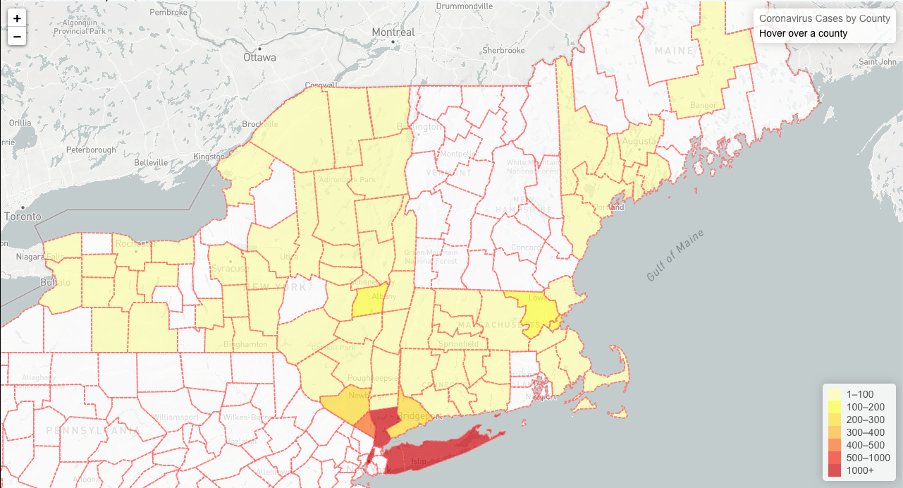
I later discovered found that the Coronavirus case numbers where in fact available nationally by county. Johns Hopkins University was publishing the data they collected on GitHub, later The New York Times also published their data.
I updated my code to pull the content from this single source, and was now able to see cases all over the USA.
Found a single source for stats in each county. The number of "hot spots" in the country seems to be rising. pic.twitter.com/AARg91ziBL
— Mubashar Iqbal (@mubashariqbal) March 25, 2020
After I shared my maps on Twitter, an outlet for my nervous energy, some people asked if they click around the map to see information closer to their locations, so I decided to publish what I had built.
I decided on the name "In Pandemic".
Currently this is just the map with data being updated automatically when published by Johns Hopkins University.
If my nervous energy persists I may add more features, I have some ideas related to the Stay at Home orders, but for now I'm satisfied with what I was able to produce with my nervous energy.